New theme for The Simple Part

Despite my best attempts at procrastination, it had to happen sooner or later. Stephen Reinhardt’s Light theme, the free version of which has served this blog well and faithfully for the last year and something, has finally been decommissioned. Replacing it is a new theme I clobbered together over the last week.

One of the reasons I moved this blog off the old wordpress.com subdomain – the only reason in fact – was to allow me to mess around with it as much as possible. Writing the theme is one such messing, though a number of things got in the way and meant that it took a while longer to get started than originally intended.

This theme will be considered a permanent work in progress. I’d be interested in any comments, complaints or suggestions concerning its usability (or lack thereof), appearance (or hideousness thereof), or anything else which may be handy or simply cool.

With thanks to Emilyn and SZC, whose advice prevented a number of crimes against aesthetics and partly offset my inability to work with colour schemes more complex than black and white.

In the beginning were the words, and the words were “It sucks”

In his Tech-Ed session “Why software sucks”, David Platt was explaining why, in fact, software sucks. The reasons were not some mystical ramblings, or some pseudo-scientific best guesses. It was all solid common sense; problem being that, since designers and developers often know the conventions too well, we will often assume, without a second’s thought, that our users know the same conventions. I was sufficiently impressed by the session (Delivered in an hour long chunk of what can be called good stand-up comedy entertainment. Reminded me a little of George Carlin, really 🙂 ), to buy his book.

Do you really want to delete this file? Hmm, no, what I really wanted to do was give it a back massage…

To take one of the examples from “Why software sucks” and give it shape: consider a confirmation box. You know the kind… “Do you really want to …?”. Can’t stand the damn things myself. Platt makes a few well considered arguments against them; the main ones being:

1. If a user clicked the button, he or she REALLY wants to do that action.

2. Unless the button was clicked accidentally, in which case, your user interface design sucks.

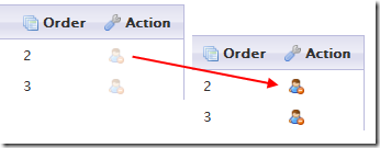
I’ve been working on a WordPress contact management plugin recently, and decided to slip this idea in. The delete button for each contact starts off disabled, and it is only enabled while the user holds down the CTRL+D key combination:

delete_contact

And that’s that, once you’ve clicked, it’s deleted with no further confirmation. Once this gets tested for a while, I’ll post any further observations here.

I’ll probably change the delete icon to a more conventional x, since the little guy with a stop sign doesn’t strike me as being an obvious “delete” indicator. Then again, I guess I’ll wait to see what comes out of the test. I’m not my user, so I’ll see what they think first.

FLIRt – A WordPress plugin

The inevitable disclaimer:

This WordPress plugin was thrown together in a fit of boredom by someone who is only vaguely aware of how the API is supposed to work, and whose last real contact with PHP development was, oh, so many years ago. If you want a proper FLIR plugin for WordPress, 23systems have the real thing in the WordPress Plugins directory. The one described here is for the few, the chosen, the band of brothers (and sisters) who want a daft excuse for a plugin to take apart.

Download FLIRt here

A couple of days ago, She Who Does Web was telling me about various ways of making a web page look a bit less crap, and the difficulty of making things stand out better when the only things at your disposal are about three fonts and a bit of chewing gum. sIFR was mentioned briefly, but being a grumpy old hack, I can’t make myself plonk a Flash movie into a page for the sole purpose of displaying some pretty fonts. I said so, and then I was told of FLIR. No, I am not making these acronyms up. Continue reading “FLIRt – A WordPress plugin”