Magento Search: Getting Better Results In Product Searches

Magento is a whopping big platform – even the community edition is something of a beast. That gives it a nasty learning curve, and while, in most cases, it simply works, there are some places where it tries to be clever, with mixed results.

The product search is a case in point. A friend was recently trying to get it to cooperate, but the way the results were being returned made it quite unusable. By default, the search uses an OR comparison to find what you’re after, so if you look for “web development books”, it will give you any product whose description contains “web”, “development”, or “books”. Since the order or relation of the words is not considered, you might end up with Twilight as a top result, which I’m sure you’ll agree, is not conductive to your users not gutting you with a rusty fork.

The easiest way I found to fix this, is to change the search query, defined by the fulltext.php file (/app/code/core/Mage/CatalogSearch/Model/Mysql4/fulltext.php). Continue reading “Magento Search: Getting Better Results In Product Searches”

In the beginning were the words, and the words were “It sucks”

In his Tech-Ed session “Why software sucks”, David Platt was explaining why, in fact, software sucks. The reasons were not some mystical ramblings, or some pseudo-scientific best guesses. It was all solid common sense; problem being that, since designers and developers often know the conventions too well, we will often assume, without a second’s thought, that our users know the same conventions. I was sufficiently impressed by the session (Delivered in an hour long chunk of what can be called good stand-up comedy entertainment. Reminded me a little of George Carlin, really 🙂 ), to buy his book.

Do you really want to delete this file? Hmm, no, what I really wanted to do was give it a back massage…

To take one of the examples from “Why software sucks” and give it shape: consider a confirmation box. You know the kind… “Do you really want to …?”. Can’t stand the damn things myself. Platt makes a few well considered arguments against them; the main ones being:

1. If a user clicked the button, he or she REALLY wants to do that action.

2. Unless the button was clicked accidentally, in which case, your user interface design sucks.

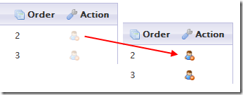
I’ve been working on a WordPress contact management plugin recently, and decided to slip this idea in. The delete button for each contact starts off disabled, and it is only enabled while the user holds down the CTRL+D key combination:

delete_contact

And that’s that, once you’ve clicked, it’s deleted with no further confirmation. Once this gets tested for a while, I’ll post any further observations here.

I’ll probably change the delete icon to a more conventional x, since the little guy with a stop sign doesn’t strike me as being an obvious “delete” indicator. Then again, I guess I’ll wait to see what comes out of the test. I’m not my user, so I’ll see what they think first.